
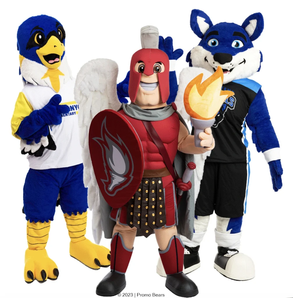
The colors that work best for mascot logos are bold, high-contrast hues that are immediately recognizable at a distance and reproduce consistently across print, digital, and physical merchandise. The right palette is not just about aesthetics — it is a strategic decision rooted in color psychology, brand alignment, and practical usability across every surface your mascot appears on.
Whether you are designing a mascot for a sports team, a university, or a corporate brand, color is one of the most powerful tools in your arsenal. The sections below answer the most common questions marketing and brand teams ask when approaching mascot design.
How does color psychology influence mascot logo effectiveness?
Color psychology directly shapes how audiences perceive and emotionally respond to a mascot logo. Each color carries a set of associations that can either reinforce or undermine the personality you want your mascot to project. Choosing colors intentionally means your mascot communicates the right message before a single word is read.
Here is how some of the most common mascot colors tend to perform:
- Red conveys energy, passion, and urgency — ideal for sports teams and brands that want to project excitement and competitive spirit.
- Blue signals trust, reliability, and professionalism — a strong choice for corporate mascots and educational institutions.
- Yellow and orange radiate warmth, optimism, and approachability — popular for mascots targeting families, children, or consumer-facing brands.
- Green communicates health, nature, and growth — well suited for wellness brands, environmental organizations, and agriculture-adjacent companies.
- Purple evokes creativity, prestige, and imagination — often used by entertainment brands and universities with a tradition of excellence.
- Black projects sophistication, authority, and edge — effective as a secondary or accent color in mascot logos aimed at premium or performance-driven audiences.
The emotional weight of color is not guesswork. Brand teams that align mascot color choices with their audience’s expectations consistently see stronger emotional recall and faster recognition. When a mascot’s color palette feels right, audiences connect with it almost instinctively.
What are the most recognizable color combinations for mascot logos?
The most recognizable mascot logo color combinations use high contrast between a dominant color and a secondary accent, making the design readable at any size and from any distance. Classic pairings like red and white, navy and gold, or black and yellow have become iconic in sports and brand mascot design for exactly this reason.
Strong contrast is the underlying principle behind every memorable combination. When your mascot appears on a banner, a jersey, or a stress ball, the design needs to hold up at small scale and large format alike. Low-contrast combinations — such as light blue on white or olive on tan — tend to blur together and lose their impact when reproduced on merchandise.
Some of the most consistently effective combinations in mascot design include:
- Red and white — maximum contrast, universally bold, and instantly attention-grabbing.
- Navy and gold — conveys tradition, prestige, and authority; widely used by universities and sports organizations.
- Black and yellow — high visibility, energetic, and associated with power and speed.
- Green and white — clean, fresh, and approachable; works well for community and health-focused brands.
- Purple and gold — distinctive and memorable, with strong associations to royalty and excellence.
The best combinations also allow for a neutral third tone — typically white, black, or a light gray — that gives the mascot illustration room to breathe and adds depth to facial features and outlines.
Should a mascot logo match existing brand colors?
Yes, a mascot logo should align closely with your existing brand colors. Consistency between your mascot and your broader visual identity reinforces brand recognition and prevents confusion across touchpoints. When a mascot appears in completely different colors from the rest of your brand, it feels disconnected and can dilute the equity you have already built.
That said, matching brand colors does not mean copying them mechanically. Mascot logos often need to adapt the palette slightly to work in an illustrated, character-driven format. A color that looks refined in a wordmark may need to be deepened or brightened when applied to a mascot to maintain energy and readability.
The practical approach is to treat your brand’s primary color as the mascot’s dominant tone, use a secondary brand color for accents and details, and introduce a neutral outline color to define shapes and add dimension. This approach keeps the mascot firmly within your brand world while giving it the visual personality it needs to stand on its own.
If your brand currently uses a single color, this is also an opportunity to introduce a complementary accent specifically for the mascot — one that works in harmony with your existing palette without breaking it.
How many colors should a mascot logo have?
A mascot logo works best with two to four colors. This range gives the design enough visual interest and personality while keeping it reproducible across every medium — from embroidery on a costume to a small print on a keychain. Using too many colors increases production complexity and can make the mascot look cluttered and harder to recognize at a glance.
The two-to-four color rule applies to the primary colors in the design. Shading, gradients, and subtle tonal variations used within those colors are acceptable and can add depth, but the foundational palette should remain tight. When a mascot needs to be reproduced on promotional merchandise, costumes, and digital assets simultaneously, a focused palette ensures consistency across every format.
If your mascot design naturally calls for more detail — for example, a character with realistic fur textures or complex clothing — work with your designer to identify which colors are structural and which are decorative. Structural colors define the mascot’s identity. Decorative colors can be simplified without losing the character’s essence.
What colors should be avoided in mascot logo design?
Colors that lack contrast, reproduce poorly across different materials, or carry unintended cultural associations should be avoided in mascot logo design. Neon shades that look striking on screen can appear washed out in print or on fabric. Very light colors on white backgrounds disappear. And certain color combinations carry meanings that may not translate well across different audiences and markets.
Specific colors and combinations to approach with caution include:
- Pastels as dominant colors — they tend to lose impact on merchandise and can make a mascot appear weak or forgettable rather than bold and engaging.
- Highly saturated neons — while eye-catching digitally, they are notoriously difficult to reproduce accurately in physical production, leading to inconsistency across products.
- Low-contrast combinations — yellow on white, light gray on silver, or pale blue on white all reduce legibility and visibility at scale.
- Too many competing hues — using five or more distinct colors without a clear hierarchy creates visual noise and weakens the mascot’s identity.
It is also worth considering how colors read across different backgrounds. A mascot that only works on a white background will struggle when placed on dark merchandise, colored backdrops, or digital screens with varying display settings. Design with flexibility in mind from the start.
How do mascot colors translate across merchandise and costumes?
Mascot colors translate across merchandise and costumes through a process of careful material matching, often using PMS (Pantone Matching System) color references to ensure consistency from one product type to the next. Without standardized color references, the same mascot can appear noticeably different on a plush toy, a stress ball, a costume, and a printed sticker — which undermines brand cohesion.
Each production method has its own color behavior. Fabric dyes for costumes, foam pigments for stress balls, printed inks for stickers, and injection-molded plastics for keychains all interact with color differently. A deep red that looks vivid on a costume may appear slightly darker on a foam product or slightly brighter on a gloss-printed sticker. Working with an experienced production partner who understands these material differences is essential for keeping your mascot looking consistent across every touchpoint.
Colors with high saturation and clear PMS references tend to translate most reliably. Gradients and complex shading are harder to reproduce in three-dimensional products like costumes and plush toys, so simplifying those elements for physical production while keeping them in digital formats is a practical approach many brand teams adopt.
Thinking about color consistency early — before production begins — saves significant time and cost in revisions later. When your mascot design is built around a reproducible palette from the start, every product in your mascot merchandise lineup reinforces the same brand identity.
How Promo Bears helps you get mascot colors right
Getting mascot colors right across every product and format is exactly where we excel. At Promo Bears, we work with marketing managers and brand directors to develop a mascot design that is not only visually compelling but built for real-world production from day one.
Here is what we bring to the color and design process:
- A free concept illustration based on your logo or design idea, with unlimited revisions until the palette and design are exactly right
- PMS color matching across product types, including custom mascot costumes, plush toys, and stress balls (produced in 10 to 12 weeks after design approval)
- A dedicated project manager who oversees color consistency from the initial illustration through to final production
- Over 19 years of experience in mascot design, with more than 4,000 mascots produced for brands including NASA, Amazon, and Walmart
- End-to-end production covering costumes, inflatables, plush toys, and a full range of branded merchandise
Your mascot is one of the most visible expressions of your brand. Getting the colors right is not a detail — it is the foundation. If you are ready to bring your mascot to life with a design that works beautifully across every format, get a free quote and let us show you what is possible.
Frequently Asked Questions
Can I change my mascot's colors after it has already been produced on merchandise?
Yes, but it comes with real costs and complications. Rebranding a mascot’s color palette means retiring existing inventory, updating all digital assets, and re-producing every physical product — from costumes to plush toys — which can be a significant investment. A better approach is to pressure-test your color choices thoroughly before production begins by reviewing them across multiple formats, backgrounds, and material samples. Getting it right the first time is always the more cost-effective path.
How do I know if my chosen mascot colors will look good on dark-colored merchandise?
The best way to evaluate this is to mock up your mascot design on both white and dark backgrounds before finalizing anything. Colors that rely on a white background to pop — particularly light yellows, pastels, or pale neutrals — will often disappear or look muddy on navy, black, or dark green merchandise. Ask your designer to provide dark-background versions of the mascot early in the process, and make sure your palette includes a strong outline or contrasting tone that keeps the character readable regardless of the surface it appears on.
What is the difference between RGB and CMYK colors for mascot logos, and does it matter?
RGB (used for digital screens) and CMYK (used for print) have different color gamuts, meaning some vivid digital colors simply cannot be reproduced accurately in print or on physical products. This matters a great deal for mascot logos because a color that looks electric on your website may appear duller on a printed banner or embroidered costume. Working with PMS (Pantone) color references from the start bridges this gap — Pantone codes give every production partner a standardized target to match, regardless of the medium or material they are working with.
How do I choose mascot colors if my brand currently has no established color palette?
Start with your audience and the emotional message you want your mascot to communicate, then work backward to a palette. Define one dominant color that captures your brand’s core personality — energetic, trustworthy, playful, premium — and then select one complementary accent color that creates strong contrast alongside it. Add a neutral (black, white, or gray) for outlines and depth, and you have a functional three-color foundation. This is also an ideal moment to lock in those colors as the start of your broader brand identity so that your mascot and your visual system grow together from day one.
Is it a problem if my mascot colors are similar to those of a competitor or rival team?
It can be, particularly in markets where color combinations are strongly associated with specific brands or teams. Using a palette that closely mirrors a well-known competitor risks creating confusion in the marketplace and may weaken your mascot’s ability to stand out. Before finalizing your color choices, audit the competitive landscape in your industry or region to identify which combinations are already heavily claimed. Even a slight shift in hue — a deeper navy versus a bright royal blue, or a burnt orange versus a standard orange — can create enough differentiation to establish a distinct visual identity.
Do mascot colors need to be adjusted for international or multicultural audiences?
Yes, color carries different cultural meanings across regions, and those associations can significantly affect how your mascot is received in international markets. White, for example, is associated with mourning in several Asian cultures, while green carries political or religious significance in some Middle Eastern contexts. If your mascot will be used globally or in multicultural communities, it is worth conducting a cultural color audit with regional input before finalizing the palette. The goal is not to strip out all meaning, but to ensure your color choices do not inadvertently communicate something you did not intend.
How long does the mascot color approval process typically take before production can begin?
The design and color approval phase typically takes anywhere from one to three weeks, depending on how many revision rounds are needed and how quickly stakeholders can align on the final palette. Working with a partner who offers unlimited revisions — and who presents the design across multiple background and format mockups from the start — significantly reduces back-and-forth time. The key is to involve all decision-makers in the review process early rather than routing approvals sequentially, which can add weeks to the timeline before production even begins.